Some of our users have been confused about how GlassWire’s graph scaling works so we wanted to post an explanation to help avoid confusion.
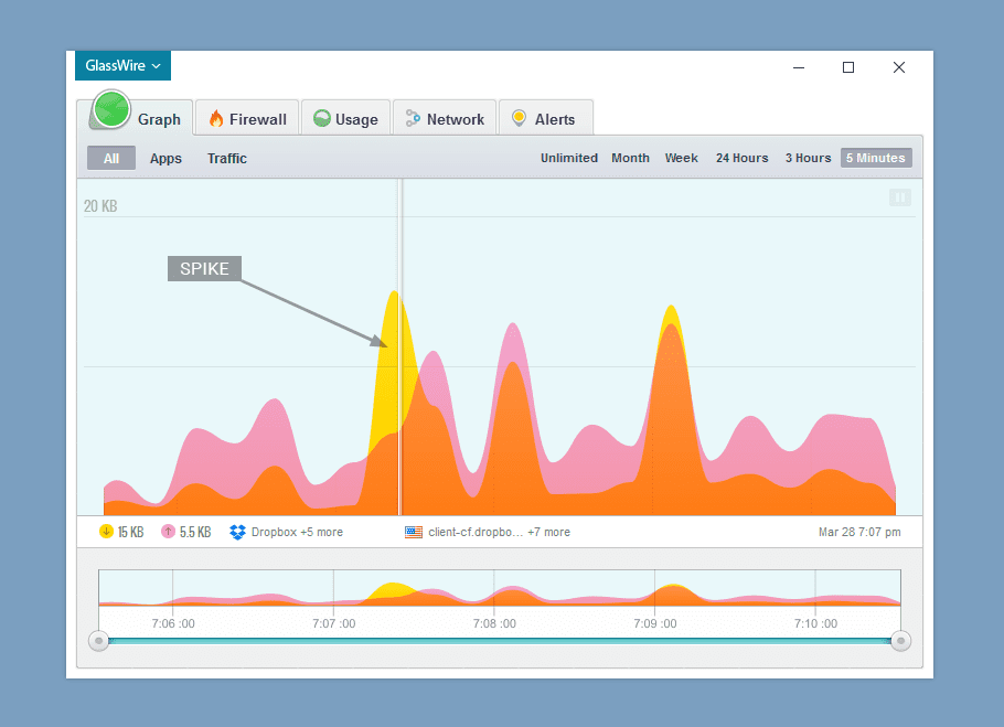
Please see the GlassWire graph example above. This example shows that over the past 5 minutes you have downloaded 20 KB worth of data. When you downloaded the most data you’ll see there is a spike on the graph. Now I’d like to explain what the graph spike shown above means, and how much data was actually downloaded at that point.
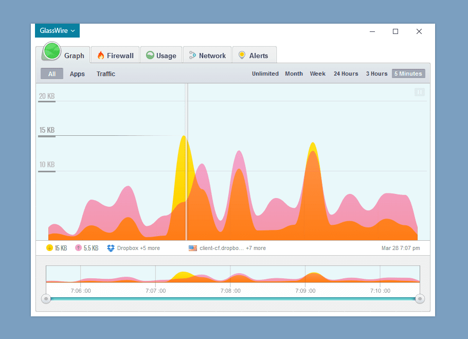
Please check the upper left of the graph where it shows that the upper limit of the graph is 20 KB. This means that this spike is less than 20 KB. So you can estimate that this spike is about 15 KB of data.
So now you’ve estimated that this spike is about 15 KB. Now you can confirm your suspicions by setting the vertical line on this spike, then clicking the graph to see that your estimation is correct.
Please also note that when you click the graph you can see below what apps/hosts used the most data at that point in time on the graph. For example in the image below you could click the “Dropbox” icon or the “client-cf” American Flag icon to see what hosts/apps caused this spike and what hosts they were communicating with.
Now you are able to associate the scale of the spike with the top left label.
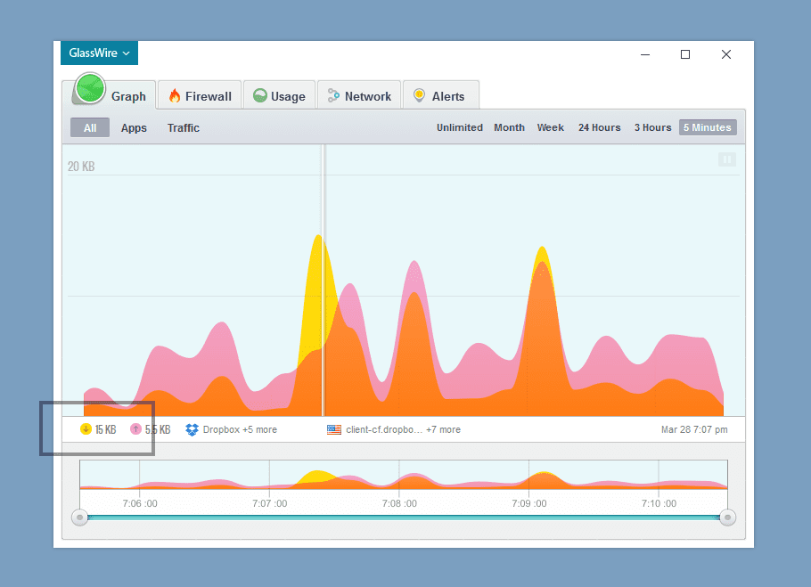
There is also a bandwidth label at the bottom left of the window. Bandwidth means the number of bytes divided to the time of transfer. So if the 15 KB file was downloaded during 10 seconds, the bandwidth will be 15 KB per second.
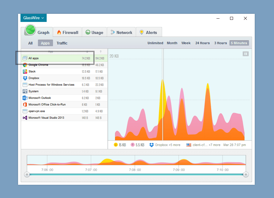
With regards to our graph this will mean that we have to summarize all the transferred bytes during 3 hours and divide it into 3 hours. We can implement it easily, but the problem is that the user is unable to see the sum of all the transferred data on the graph tab. So he will have to go to the Graph\Apps, see the “All apps” value and divide it into 3 hours and he will get the bandwidth, than go back to graph and continue working.
You can see that the total amount of data during 3 hours is 154.8MB, this means that the average bandwidth will be 154.8MB/3hours = 51.6 MB per hour = 14,6 KB/s.
Some users have also asked how our scaling works when you drag the GlassWire graph larger/smaller.
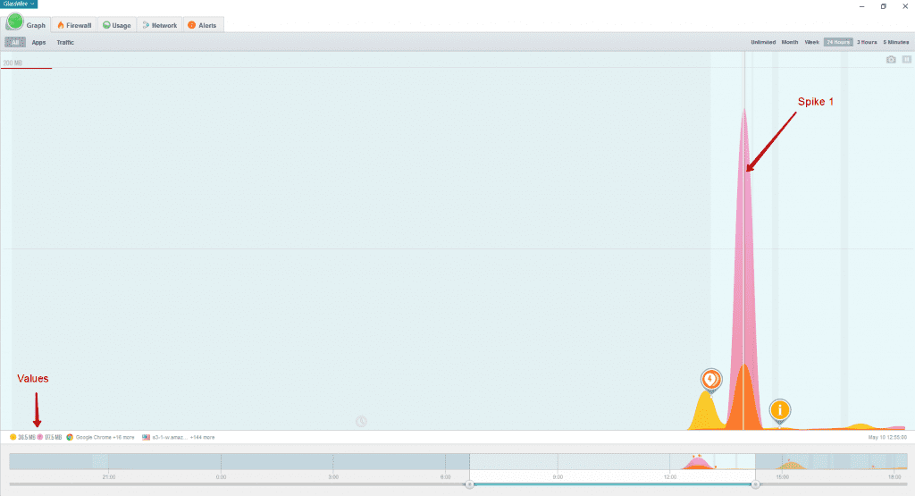
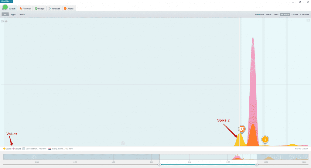
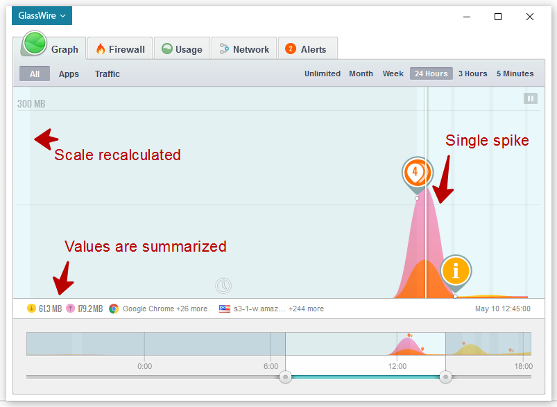
When a GlassWire user changes the window size, the graph scale also changes. We can see some spikes if the window is small, but if the size is increased those spikes may be divided into several lower spikes. And vice-versa, for example, GlassWire is running in full screen mode and we can see several spikes and then when we decrease the size of the window, those spikes will be combined into one big spike.
The amount of traffic will be also recalculated so the top left value will change.
For example, we have two spikes in 10MB and 20MB and the top right value is 30MB. Then we’ve decreased the window size so those two spikes are combined into a single spike.
Since two spikes were 10 and 20 MB, that single spike will be about 30MB. So the top right value will be recalculated too, and this is required to fit the graph in the graph area and the new top right value may be 50-60MB.
Now the window size decreased and spikes are combined.
We hope this Blog post helps explain how our graph works, and makes it easier to estimate data usage on the fly. If you have any further questions feel free to comment, or make a post in our forum.


Loren Amelang says:
This is a very important effort I’ve been wishing for since I discovered GlassWire! But I’m sorry, I’m now even more confused.
Under the first image, you say, “This example shows that over the past 5 minutes you have downloaded 20 KB worth of data.” I guess the “five minutes” is from the selection at top right, or the width of the full graph, since all of the small lower graph is selected.
But what is actually graphed? You say the yellow spike you have selected represents 15 KB of data, which matches the “15 KB” shown under the left of the graph beside the matching yellow down arrow. But if those are data volumes (KB) rather than data rates (KB/sec), how do we know the time period during which that data volume was downloaded? In the example graph, it looks like there is a separate peak about every thirty seconds, but I don’t find that is typical of my usage.
In your third image, the “15 KB” number is highlighted, and you say “There is also a bandwidth label at the bottom left of the window. Bandwidth means the number of bytes divided to the time of transfer. So if the 15 KB file was downloaded during 10 seconds, the bandwidth will be 15 KB per second.”
Unless I’m totally ms-reading you, that’s the same “15 KB” that gave a data volume indication in the earlier graph. And if the 15 KB was downloaded in ten seconds, the bandwidth is 1.5 KB/sec – that’s just pure math!
You continue: “You can see that the total amount of data during 3 hours is 154.8MB, this means that the average bandwidth will be 154.8MB/3hours = 51.6 MB per hour = 14,6 KB/s.” I’m not sure where the “three hours” suddenly comes from… The time selection and the graphs in the next image both still show five minutes. Doesn’t that time apply to the “Apps” tab as well?
What I see in that Apps tab is 74.2 KB, which seems reasonable for the yellow and orange download area of the graph to the right. If you’re suddenly including uploads as well as downloads, 74.2 + 114.2 is 188.4, not 154.8 – where do you get that value?
At the top of the page, and my comment, you said, “over the past 5 minutes you have downloaded 20 KB worth of data.” Now it looks like it was really 74 KB of data, which seems to match the whole five minute graph. The “20 KB of data” was just a graph height big enough to handle the 15 KB spike in the middle of that period.
Farther down, you say “For example, we have two spikes in 10MB and 20MB and the top right value is 30MB. Then we’ve decreased the window size so those two spikes are combined into a single spike.” I suspect you mean the “top left” graph scale value instead of “top right”? Other than that the description of changing the time period or screen size of the graph makes sense.
But I’m still puzzled by exactly what any graph is showing. If it is really showing data volume, there has to be some time segment applied in order to turn the volume into a graph height. You could be counting the bytes during each 30 second segment, and plotting the totals. But I’m pretty sure it is more complex than that… Maybe every time the bandwidth bytes/second drops off, you total the bytes since the last drop and draw a new “spike” on the graph?
When I watch the graph scroll to the left during normal activity, it sure looks like it is just drawing the momentary bandwidth, bytes/second. I don’t see it waiting for any specific period, or revising previously drawn heights. The general shapes match the graphs my router draws, which are definitely bandwidth in bytes/second. But the _values_ you apply to your graphs do not match my router, they are often far above the total capacity of my network connection! So I guess this bandwidth theory may not be true.
How do you determine the y-axis height on the graph?
GlassWire says:
@Loren,
Thanks for your feedback and comments. There are some discussions on this in our forum right now that you may want to participate in so we can continue to improve the Graph so it’s easier to understand and use.
joseph BODDEN says:
I want a meter I can read, not an equation I can solve with my computer.
GlassWire says:
GlassWire’s meter is easy to read and use. We use the same meter style on our Android app that lets people easily see how much mobile data they are using and so far we haven’t seen any feedback where someone found it confusing. If something specific is confusing you please let us know in the forum so we can help.
A E Walters says:
When I select Month, Week, 24 hours or 3 hours, the graph shows MB.
That is it shows the amount of data.
But when I select 5 minutes, the graph shows B/s or KB/s
That is it shows the rate of data.
Although 4 graphs show amount and one shows rate, all 5 graphs look similar.
This is confusing.